The Power of Neutrals: Why Color Schemes Matter in Professional Photography
The Power of Neutrals: Why Color Schemes Matter in Professional Photography
In professional photography, color can make or break the final image. It’s not just about what looks “pretty” but it’s about creating balance, mood, and focus. That’s why choosing the right color scheme matters so much, especially when it comes to portraits, branding shoots, or any professional setting.
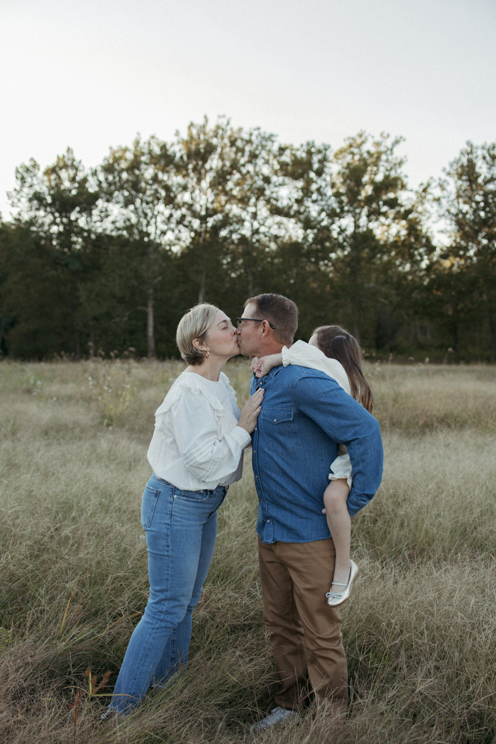
Think whites, creams, soft grays, tans, and muted earth shades. Neutral tones are timeless for a reason. They let the subject shine without competing for attention. Neutrals also create a clean, cohesive look that feels sophisticated and effortless. Whether you’re shooting indoors or outside, they work beautifully with different lighting and backdrops.
On the flip side, bright neon colors or busy patterns can steal focus and date a photo quickly. Logos, bold graphics, or statement pieces might look trendy in person, but they often distract the eye in photos. The goal is to keep the viewer’s attention where it belongs which is on the person, the product, or the story being told.
So when planning your next shoot, stick with a neutral color palette. It’s simple, elegant, and guarantees your photos will stay classic and professional for years to come.


